All civilisations rise and fall. Think of a group of people, plonk an “ancient” in front of it, and there you go – a fallen civilisation. One day, when our civilisation has fallen, relics from our own time will sit alongside ancient Egyptian hieroglyphics, ancient Roman engraved plynths and ancient Sumerian clay tablets. Historians of the future will stroke their holographic beards, adjust the lapels of their cybertweed jackets, peer over their robo-glasses, and hypothesise why the peoples of the early 21st century drank from mugs adorned with sacred curly mustaches, made graven GIF images of cats playing pianos, and recited mantras from tea towels such as “Keep Calm And Eat Cupcakes”.

To date, the closest our civilisation – and indeed all human life – came to ending was in October 1962 during The Cuban Missile crisis. The USA and the USSR’s respective big red nuclear buttons were nearly pressed by their respective big red nuclear fingers, and the world came close to seeing the opening shots of World War 3. Eventually diplomacy, rather than nuclear apocalypse, won, and less than a year later, in August 1963, a telegraph machine deep within the Kremlin clattered into life – the first message to be sent through the new hotline from the Pentagon was arriving, a vital diplomatic line of communication that was established to try to avoid future potentially civilisation-ending atomic stand offs. As the Russian translators took this first message and carefully interpreted it, they must have looked at each other in confusion. Was this a code? A threat? A warning? A Nostradamus-style foretelling of worldwide cataclysm? The apparently nonsensical message read “THE QUICK BROWN FOX JUMPED OVER THE LAZY DOG’S BACK.”

Of course, thankfully, that first message didn’t start all-out nuclear war. It was simply a pangram to test the telegraph equipment; a phrase made up of every character in a language’s alphabet. Since the mid 1880s “The quick brown fox jumps over the lazy dog” (or a variation thereof) had become known as a neat way to write every letter in the English alphabet, and by the time the USA-USSR hotline was tested it was common to use it as a way of testing communications equipment. While today in the early 21st Century it is less commonly used for testing communications equipment, the boom in desktop publishing and the place of computers in the graphic design industry means that “The quick brown fox…” is instead used to test how the characters of a font look. An ordered alphabet shows the appearance of individual letters, but doesn’t give an indication of how whole words will look – a pangram, like “The quick brown fox…” gives more of an indication of how copy will read. Therefore, when looking through menus of fonts, it’s possible that a graphic designer will see the sentence repeated hundreds of times every day.

With this in mind I thought it would be fun to create an expressive piece of lettering that spelled out “the quick brown fox jumps over the lazy dogs”, while also showing it happening. Also, I love foxes, and who doesn’t love tiny happily sleeping puppies?

While mulling it over I started a few idle doodles at my desk:

lazydog_first

lazydog_second

These very quick, loose sketches suggested the idea had legs – cartoon sleeping dogs could passingly resemble letters. After deciding to get rid of the spots on the sides of the dogs, and emphasise the dogs’ happy sleepy smiles, the next step was to sketch out a full alphabet.

After producing around 3 or 4 A3 pages of sketches, I drew in propelling pencil (my drawing tool of choice) the full a to z, along with a cartoon jumping fox, and inked them with a fine black pigment liner:

lazydog_third

lazydog_fourth

Next, I scanned the alphabet into Adobe Photoshop, removed the lines, and laid out the full phrase (against a yellow background, as it increases legibility at this first layout stage):

lazydog_fifth

Once I was happy with the overall layout, I cleaned up any inking errors and adjusted strokes which were too thin or thick. I then imported the black and white image into Adobe Illustrator to create a smoother, cleaner vector version of the image. Vector image files use points, curves and angles, and can be scaled to any size and retain their smooth lines, unlike raster image files (such as JPGs) which use pixels and are limited by resolution. At this stage I also started adding test colours to the image:

lazydog_six

Finally, I exported the file back into Photoshop to add brush effects, shading and a light texture to the characters, and adjusted the colours of the overall piece. The brush effects and textures help the lettering’s legibility, as it increases the colour contrasts through the forms of the dogs, and helps emphasise the hand-drawn effect:

lazydog_final

Until Friday 11th April 2014 you can vote for this piece of lettering in the ‘Dogs’ challenge on Threadless – if you’ve enjoyed this post and the finished piece (and, to be honest, even if you haven’t), I’d be very grateful if you visit my Threadless page and score it 5 out of 5.

I’ll also be looking into printing a limited edition run for framing and hanging – please do get in touch via the form below if you’re interested!

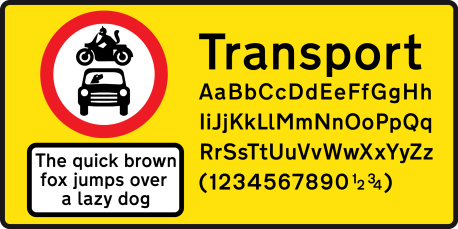
Transport_title

50 years ago, in the Autumn of 1963, the BBC broadcast the first episode of a new science fiction adventure series: Doctor Who. On November 23, it will celebrate its 50th birthday (although more accurately, it was only alive for 26 years, died, and then regenerated 8 years ago): 50 years (actually 34 years) of thrilling/boring audiences (delete as appropriate) with a simple tale of a 1,000 year old alien with 2 concurrent hearts and 11 consecutive faces, sticking his nose/sonic screwdriver into the affairs of various aliens/historic figures and travelling through time/space in a blue police box which is larger internally than externally (which might explain why the walls wobbled so much during the programme’s early years).

It’s the blue box – the TARDIS – which makes Doctor Who possible. It allows him to travel: to see new places, experience new times and meet new people. Without it he’d just be Doctor Him. In the original scripts, the TARDIS was going to change shape and appearance based on the location and time to which it was travelling – for instance, it would look like a Roman plinth in ancient Rome, an Egyptian sarcophagus in ancient Egypt, a 1960s British Police box in ancient 1960s Britain. Then the BBC looked at their budget, realized the cost of creating all these alternate TARDISes, and just stuck with the last one, explained away by a neat sci-fi line about the chameleon circuits being stuck. So, instead of an ever-changing appearance, the TARDIS was stuck with just one, forever, everywhere.

While The Doctor and his companions would always see the same 1960s blue police box TARDIS wherever he travelled, up until 1963 anyone travelling in real life Britain was confronted by an ever-changing set of road signs. A haphazard array of varying designs with different typefaces, appearances and conventions; signage commissioned by different bodies, designed by various manufacturers and overseen by no-one. In 1961, typographer Herbert Spencer showed this by documenting a short journey from central London to Heathrow airport in a series of photographic essays in Typographica magazine. Even though his journey was basically just going along the A3, it revealed a complete lack of uniformity – inconsistent colours, symbols and typefaces, changing according to the local body which had placed them, serving only to baffle road users.

By 1963 Jock Kinneir and Margaret Calvert – commissioned by the government to resolve this problem – had changed all this with their unified design vocabulary for all UK road signs, including a brand new typeface which they had designed: Transport.

Transport_specimen

Kinneir and Calvert’s primary concern was legibility – creating a typeface that could be read clearly at a distance and while travelling quickly. Despite this desire for clarity, however, they were also aware of a need for aesthetics. They avoided the stark, geometric sans serifs which were growing in popularity – instead, motivated by a desire to produce a font that would be sympathetic to the English countryside, they designed a sans serif that would be rounded, friendly and warm.

While Kinneir and Calvert set out to unify signage for the UK, their font was so successful at making roads clearer that it was also adopted for road signage in other countries around the world. Travel to Denmark, Greece, Hong Kong, Iceland, Ireland, Italy, Portugal, Spain and much of the Middle East, and you’ll use Transport (or a virtually identical bolder variant) to help you find your way.

Like a TARDIS with functioning chameleon circuits, Transport makes effective travel possible, while also managing to remain almost unnoticed – quietly but confidently helping travellers, wherever they find themselves. Transport is an excellent example of a classic typeface that will stand the test of time, carrying out its duties as intended without difficulty. To this day, 50 years later, every road sign in Britain is still typeset in Kinneir and Calvert’s Transport font; a part of the design tapestry of modern Britain. Happy 50th Birthday, Transport.

Print

When I was 7 years old I visited London for the first time. It was August 1992 and I spent most of the day encased in the hood of my cagoule. My memories of that visit have blue waterproof bars at each side, like an old 4:3 ratio VHS playing on a widescreen TV, and centre around Trafalgar Square: a grey blur of rain-soaked concrete and The Pigeons. If I saw pigeons at home in Oxford they would be anxiously gathered in threes or fours, gently cooing at each other like nervous members of a support group. But in Trafalgar Square The Pigeons were a different, bold breed, swarming and swooping and swishing their wings with a greedy courage that comes from exposure to tourists oddly intent on hand feeding vermin. To me, The Pigeons were noisy, chaotic and confusing, which was also exactly how I felt about the rest of London.

Print

I wasn’t a very cool kid: I’d just discovered I was scared of pigeons, I wore a blue cagoule with the hood up, and my trousers had green diamond patches stitched over holes in the knees. As I went down into the Tube the noise, chaos and confusion of London took on a different tone, like it was suddenly subject to rules that didn’t exist on the surface. By the age of 7 I was a connoisseur of structure, consistency and order, as only a quite uncool child can be, and I could tell that on the Tube there was definitely a structure, consistency and order, and I liked it. I saw a couple kissing passionately at the other end of my Tube carriage (I instantly felt possessive of the Tube) and was incensed that they somehow weren’t showing the Tube the respect it deserved – no, demanded. I really wasn’t a very cool kid.

This year, 2013, is the 150th anniversary of the first underground train service in London, and to celebrate, the London Transport Museum are exhibiting 150 posters from the history of the Underground. Some posters are familiar, some are less well known, but each simultaneously shows something of the time when they were created and a connection to Tube passengers today. One poster by Alfred Leete, “The Lure of the Underground,” shows crowds of passengers literally flying into a station entrance, enthralled by the irresistible draw of the comfort and ease of Tube travel. Though it was designed in 1927, it perfectly captures how I felt 65 years later when I first approached the stairs that led to Charing Cross station.

The man who made the biggest contribution towards the attractive order and consistency of the Underground was Frank Pick: his aim was to unite the network through standardisation, so that it was less confusing, more familiar, and easy to navigate. As well as being the 150th birthday of the Underground, 2013 is also the centenary of the conception of what is, in my opinion, Frank Pick’s most visionary innovation for the Underground – its typeface. By 1913 Pick had become convinced of the need for a corporate typeface for the Underground. He knew that the order and unity he craved for the network had to be supported by a single typeface that could be used for all signage, posters and maps. Pick commissioned the calligrapher Edward Johnston to start work on designing a typeface for the Underground, stipulating it should possess “the bold simplicity of the authentic lettering of the finest periods” and belong “unmistakably to the twentieth century”. Showing his understanding of the value of iconic design, he added that each letterform should be “a strong and unmistakeable symbol.”

Print

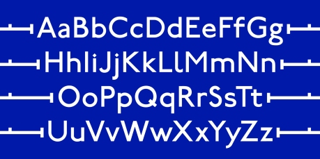
By 1916 Johnston had finished work on his font, which he named, with suitable simplicity, Underground. A sans serif with uniform stroke widths, it was inspired by the painted signs of the tradesmen that Johnston saw as he travelled around London. With the intention of creating a distinctive and legible set of letters, Johnston based his alphabet on square and circular geometry. Upper case letters took their proportions from the square forms of carved Roman letters, while lower case letters were drawn with soft curves suggesting flowing perfect circles. The upper and lower case O letters are circular, as are the bowls on the b, d, g, p and q. The l and y have curved kicks to them, which hint at the flow of a calligrapher’s pen. Johnston’s background as a calligrapher also led him to create each letter around the framework of a stack of 7 diamond-shaped ink pen strokes – this can be spotted on the diamond-shaped dots above the i and j letters. All these features, shown below – the uniform strokes, circular curves and bowls, calligraphic kicks, and subtle reminders of the diamond-shaped frame – made Underground a bold and distinctive unmistakably twentieth century font, just as Pick had specified.

Print

In the years after Underground was introduced, a second, bolder weight of capitals was added (and was met with Johnston’s disapproval: apparently for decades he refused to speak to the typographer who had betrayed him by designing the bold capitals), and Underground was renamed Johnston’s Railway Type, and then simply Johnston. As Frank Pick had intended, it became an integral part of the personality of the Underground network, consistently seen all over Tube stations and carriages. Through the 1960s and 70s other fonts started to creep into the fabric of the design of the Underground (as you can see in the 60s and 70s posters in the transport museum’s exhibition), and Johnston looked like falling out of favour. However, in the late 1970s the typographic agency Banks & Miles suggested reviving Johnston, making slight improvements to Edward Johnston’s original designs. In 1979 New Johnston was introduced, and has continued to be used as the corporate typeface for the Underground – and Transport for London – ever since.

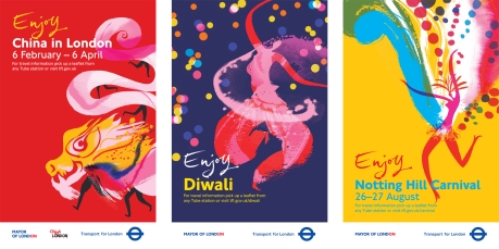
New Johnston is beautifully and quintessentially British, keeping the charm and feel of the original, but with an added refined quality. And it is a joy to work with – in my first design job I worked for Transport for London, producing Tube maps, signage and posters, such as the seasonal events campaign (shown below), and always relished typesetting the perfect letterforms of New Johnston. It is probably the most reliable, hard-working font I’ve ever used – without fail it adds a bold clarity to everything it’s applied to. It’s the typographic equivalent of a Stephen Fry voiceover. Calm, clear, charming. The perfect English gentleman of type.

Print

(Examples of 3 posters I designed for Transport for London)

First as Underground and Johnston, now as New Johnston, the font commissioned by Frank Pick 100 years ago has come to represent not only Transport for London, it’s also become a typeface for London, as much a familiar part of the city’s rich soup of design classics as the black cab, red telephone box or bobby’s helmet. Whether welcoming the world to the Olympic games last year, or informing seasoned commuters of the latest service alterations, it is Johnston’s font that helps guide us, as it always does, bringing order to the noise, chaos and confusion of the city.

Print

Last night, as I lay in a bath of gradually cooling water, like the inverse of how you’re supposed to cook a lobster, I thought, “this is a bit unusual.” That makes it sound like I’m going to get unnecessarily medical. Let me rephrase that. Last night, it occurred to me that lying in a pool of water, inside a house, is, in the grand scheme of things, a fairly recent development. The entire story of human civilization has been about trying to get out of the cold and wet and find somewhere warm and dry to set up a nest. But as our nests got more advanced we realised that a bit of water, in specific circumstances, would be quite handy. And so plumbing was invented.

Plumbing is something that equally impresses and baffles me. If I had to work out from scratch how to ensure that every house in the country has a series of pipes that supply fresh, clean water to the inhabitants, I wouldn’t have a clue where to start. Even the plumbing just in my own house baffles me. Give me a few cardboard boxes and some rolls of coloured vinyl sheeting and I know I can make, for instance, a reasonably impressive Optimus Prime costume. But ask me to fix a plumbing problem and I will return with a confused and disgruntled (and probably damp) face. There’s a sort of puddle that appears on one of my kitchen work surfaces every now and again, somewhere near the boiler, I think. Anyway, sometimes the puddle’s there, and sometimes it’s not. I haven’t a clue what to do about it, or even if I could do anything about it. I think I’m resigned to letting it get on with doing its own thing, sort of like the weather.

As my bath got cooler, I started to wonder what the world would be like if everyone was as clueless as I am with water. What if, for instance, one day large numbers of people decided that proper plumbing was all very well and good, but actually, what might be really quite snazzy would be an irreverent twist on the boring, stuffy tradition of pipes and valves and things. Brightly coloured drinking straws might be fun. Imagine if people started ripping out all the pipes in their houses and cobbling together a ramshackle system of drinking straws instead. As established, I am not a plumbing expert, but I reckon the results would be pretty horrendous.

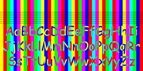
Something similar has happened typographically in the last 20 years or so. Instead of people deciding to use drinking straws for plumbing, people have decided to use the font Comic Sans in all sorts of odd contexts for which it isn’t suitable.

In 1930, the typographical scholar Beatrice Warde made a speech in which she suggested good type should be clear and refined like a crystal goblet holding fine wine. Using Comic Sans is like sticking a cheap plastic drinking straw into that crystal goblet. Like a brightly coloured drinking straw, it’s best suited for children’s parties, and best avoided for almost everything else. In other words, using Comic Sans sucks.

Print

To understand just why that is, we need to look at why Comic Sans was originally created. In the early 1990s Microsoft were developing a new piece of software called Bob. The intention was to create an interface that would make using a computer an easier, friendlier experience. Central to this was a yellow cartoon dog called Rover who spoke to the user through comic-style speech bubbles. In 1994, Vincent Connare, employed by Microsoft as a “typographic engineer”, noticed that Rover’s speech bubbles used Times New Roman, a formal and slightly authoritarian serif font. He realised that a more fun, loose, friendly font was needed and started work on what would become Comic Sans. In the end, Bob was released without Comic Sans, and flopped. But Comic Sans lived on. It started to be used in other Microsoft products. It was included in Windows operating systems. Comic Sans had escaped. The font that was only ever supposed to be the fun, childlike, informal voice of a little yellow cartoon dog started to be used in various inappropriate contexts.

Print

Nothing typed in Comic Sans will ever look serious or authoritative, sensible or grown-up. Because of the way the letters have been designed, it can only look sloppy, ill-considered, quickly rendered and childish. It’s easy to sneer when Comic Sans is used, because it is, in almost all cases, such a bad choice of font. I think that in these cases people are just looking for something different to (what they think are) all the other boring, staid, smart fonts. Maybe designers, safely ensconced in ivory towers, looking down at the uneducated public and sneering, have brought the Comic Sans revolution on themselves. Most people don’t understand how something as apparently simple as the choice of a font can inspire such revulsion and hatred within a supposedly sensible human being. If typographers could do a better job at communicating and educating people about the beauty of typography, and exactly why bad fonts and font choices are bad, everyone could start to see why there are much more appropriate fonts than Comic Sans. And maybe then it can finally go back to only having that single application as the voice of a little yellow cartoon dog called Rover.

Chicago_TITLE

I’m writing this on a shiny, smart, cool new Macbook, which means it’s almost certainly going to be several times more clever and creative than the previous bits I’ve written, which were (and I hope you can find it within yourself to forgive me, because I’m quite ashamed to admit this) all done on a very ordinary, very cheap, very plastic-encased PC. I know. I’m really sorry.

Obviously, anything created on an Apple Mac is better, in the same way a Mont Blanc fountain pen will, obviously, always produce better writing than a slightly-chewed Bic Biro. We know people who use Macs are smart and cool and clever and creative, because we’ve seen smart, cool people casually using them in Starbucks, or in smart and cool adverts, or in films, being smart and cool like people in films often are. You’re probably overwhelmed by the smart coolness of these Mac-typed letters oozing out of your screen right now, like expensive and delicious oil oozing out of a truffle (I think truffles ooze expensive and delicious oil, I think I saw it in an advert once).

As I stood in the Apple Store and handed over (a lot of) money to a smart, cool chap wearing a bright blue T shirt and sporting A Haircut, I thought back on the past three years I spent using a PC. Admittedly, it worked perfectly well, and I did all the same designing and writing on it that I would have done on a smarter, cooler computer, and it was a lot cheaper to buy, and has basically done the jobs I’ve given it to do, but it’s been an ordeal. Do I mean ordeal? Well it wasn’t a Mac, was it, so yes, actually, that’s right, it was an ordeal. I wasn’t a PC user, I was a refugee, a Mac user in exile.

Is there a reason that Apple computers are seen as the natural choice for designers? Unsurprisingly, I think there is, and I think it all comes back to typography.

While at college Steve Jobs started dropping into calligraphy classes simply because he had a passing interest in typography; “I learned about serif and sans serif typefaces, about varying the amount of space between different letter combinations, about what makes great typography great… Ten years later, when we were designing the first Macintosh computer, it all came back to me. And we designed it all into the Mac. It was the first computer with beautiful typography.”

The woman who had the task of putting typography into the heart of the Mac was Susan Kare. In 1983, a year before it first went on sale, she started work on a series of digital fonts, carefully drawing each letter pixel by pixel. These fonts were the first typefaces designed for use on a computer that used something called proportional spacing – rather than having an unnatural uniform monospaced width, like on a typewriter, letters could occupy just the right space they needed to look like the typography that existed in the print world.

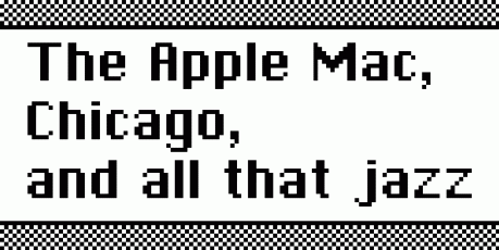
Chicago_PANGRAM

The first 
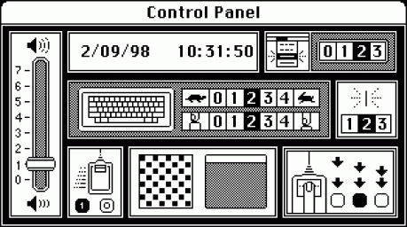
font Susan Kare designed was bold, subtly curved, with contrasting stroke widths, which made it easy to read on small computer screens. It had personality; it felt friendly and reassuring. The font was Chicago (it was briefly and awfully called Elefont, the bad pun stemming from the soft curves and boldness that gave it a sort of cartoony pachyderm quality), and it became an integral part of the early Apple Mac experience, used in every menu, button, label and system message.

Mac_control_panel

In addition to Chicago, Kare also designed New York, a Roman serif font; Geneva, a Swiss-style sans serif; Athens, a solid slab serif; Los Angeles, a script face which had the appearance of handwriting; and San Francisco, a font made from a jumble of stylized characters, giving a sort of ransom-note feel. In a technological, typographical way, this was like jazz – free expression, without the restrictions and rigidities of the earlier age, was suddenly possible on a computer. Type foundries began making their own fonts available digitally, and designers began to see that the computer – crucially, the Apple Mac – could be used in a way that replicated the freedoms of traditional printing.

Designers had picked their side in the conflict with the PC. The initial allure of good typography was the call to arms, the battle lines were drawn, and the industry standard has been in the Apple camp ever since. Yes, today a designer could easily use a PC instead, but thanks in part to Jobs’ vision for a computer that could do beautiful typography, 30 years after the creation of Chicago most designers are still loyal to Apple.

And the smart, cool shininess probably helps too.

(Original Macintosh control panel image from the Susan Kare’s website www.kare.com)

Print

Ironically, one of the few reasons you might not be aware of the Second World War KEEP CALM AND CARRY ON branded poster/teatowel/mug/notebook/keyring/home pregnancy testing kit trend is if you’ve time travelled from the early 1940s. If you have just been flung 70 years through time, and, somehow, found yourself reading this blog, let me explain.

Firstly, 1940s time traveller, don’t panic (my advice would be to keep calm and carry on). You should fit in to present-day Britain: Europe seems to be in disarray, Britain is being ruled by a coalition government, and the Daily Mail is still trying to pretend it was never sympathetic towards fascism. Secondly, the good news is that the 1940s Britain you’ve just left was never invaded by Germany. And so you have never had cause to see posters bearing the message ‘KEEP CALM AND CARRY ON’, as, after they were designed in 1939, they were never used.

Until now.

Present-day Britain has been invaded by a legion of KEEP CALM AND CARRY ON posters, mugs, T shirts and other items of generic derivative tat. So what’s the big problem with this phe-nostalgia-menon? Where did it appear from? And when will it all end?

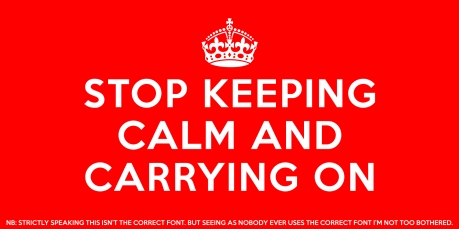
KCACOPosterThe poster itself seems undesigned. It’s the government-sanctioned equivalent of a quickly-typed office note ordering workers “DO NOT LEAVE DIRTY MUGS IN SINK”. It’s an anti-design design where the only brief is to simply shout a message as loudly and clearly as possible. Telling people to “KEEP CALM AND CARRY ON” is about as comforting as saying “BIG BROTHER IS WATCHING YOU” or “YOU ALMOST CERTAINLY SHUT YOUR FRONT DOOR PROPERLY”. There’s no reason given, no explanation, nothing inherent to the design or the typography that makes it calming or comforting or persuasive: just the ultimate in propaganda. A stark instruction intended to be taken on faith, all on the oh so calm bright blood-red background. Red for stop. Red for danger. Red for war. It’s all a bit silly, really.

The type on the poster is set in Caslon Egyptian (1816), thought to be the first sans serif typeface to be sold commercially. With stout, solid characters, geometrically rounded curves and uniform stroke widths, it was inspired by block letters that would have been hand painted by signwriters of the era, and has a very authentically British feel. The font was first seen in a specimen book produced by William Caslon IV, and, although it wasn’t instantly successful (and isn’t widely available today), you could say it was influential. In the two centuries that followed sans serif typefaces flourished (without flourishes, if you see what I mean).

Because Caslon Egyptian is such a difficult font to find in an easily usable digital font format, many derivative KEEP CALM AND CARRY ON items use sans serif fonts such as Avenir (created in 1988 by Adrian Frutiger), which has some stylistic similarities to Caslon Egyptian. Others will often use classically British typefaces such as Gill Sans, which manages to look authentically English while also being completely wrong.

Barter Books, the bookshop in the North East of England where the 1939 poster was rediscovered in 2000 (the patient zero in the viral spread), erroneously use Gill Sans on their KEEP CALM AND CARRY ON website. They also claim that Caslon Egyptian was used as it made the posters difficult to counterfeit by the enemy – slightly ironic given the proliferation of copies and parodies that have since spread. Today people aren’t too worried about accurately counterfeiting KEEP CALM AND CARRY ON. You can easily find copies made not only using Avenir or Gill Sans, but also fonts that share few stylistic features with Caslon Egyptian. Typefaces like Verdana, Arial or Century Gothic.

Print

Despite (or maybe because of) the poster’s message and design being almost comically un-calming, it has been hugely successful, finding a particular foothold in the public consciousness as the global economic meltdown grew in mid 2007. If there’s three things Brits enjoy, it’s a) nostalgia, b) proudly self-mythologizing our stiff upper lips, while c) being aware our cultural heritage is often quite twee and silly. In that context KEEP CALM AND CARRY ON found an audience it was never given in the Second World War. You can see the slogan and its’ derivatives everywhere from up-market boutiques to down-at-heel street markets. It has become as universal as the common cold, constantly mutating and evolving while keeping the same essential form. There is apparently no cure. The list of KEEP CALM AND CARRY ON derived slogans could go on for ever and at the moment looks set to. The other day I saw a T shirt with the slogan KEEP CALM AND GANGNAM STYLE. I mean, for goodness sake. Someone wore that, in public, knowing other human beings could see them.

So what, if anything, can we learn from all of my moaning? Firstly, designers like me get very easily irritated by design trends which are equally ubiquitously popular and unimaginative. Secondly, a joke can get very tired, very quickly. And thirdly – it’s almost certainly time to stop keeping calm and carrying on with KEEP CALM AND CARRY ON.

(photo of KEEP CALM AND CARRY ON poster from the Barter Books website www.keepcalmhome.com)

Print

In 1968, Stanley Kubrick’s 2001: A Space Odyssey was released. If you’ve never seen it, this post contains some spoilers – but then, watching it for the first time is the kind of experience where you could know every detail of the plot anyway, before being utterly blown away by actually seeing it. Kubrick has said of the film, “I tried to create a visual experience, one that bypasses verbalized pigeon-holing and directly penetrates the subconscious with an emotional and philosophic content.” Which, I think, is basically a director’s way of saying “Just see it, because it’s not like anything else you will have ever seen before.” Which would be accurate. And if you haven’t seen it, I’ll wait here for you while you go and rectify that. See you in 2 hours and 28 minutes.

INTERMISSION

One of the film’s most iconic moments comes right at the start, in the opening seconds: as the Sun, Earth and Moon appear on screen, “Also Sprach Zarathustra” starts playing. If you don’t recognise that title, you’ll almost certainly recognise the tune. Even when performed hilariously badly – as here, by the Portsmouth Sinfonia – it remains a classic piece of film music:

The Portsmouth Sinfonia was an orchestra made up of people who couldn’t read sheet music or were playing an instrument that was totally new to them. This created an excellent demonstration of how complex reading (in this case, sheet music) can be. Even those who were able to read music weren’t able to perfectly process that information and express it back through an instrument they couldn’t play.

The antagonist in 2001: A Space Odyssey almost certainly wouldn’t have a problem reading sheet music. A super-intelligent computer called HAL 9000, he had responsibility for the running of the space ship. He boasts that he is “foolproof and incapable of error” (in the same way as the term “unsinkable” is bandied around in the film Titanic), and then obviously he goes insane. Of course. Because that’s what happens in films (bit of a pigeon-hole there Stanley, sorry). As the two crew members secretly plot to disconnect him, HAL works out their intentions from reading their lips. And then tries to kill them.

By the time cinema audiences had seen a fictional computer read lips and turn psychotic in 2001: A Space Odyssey, real, non-fictional, non-murderous (probably) computers were already just about capable of reading typed letters and numbers. This was – and still is – called OCR – Optical Character Recognition. However, in an era where computers were fairly underpowered – especially if compared to HAL 9000 – each character had to be as distinct as possible. Just as the Portsmouth Sinfonia struggled with interpreting their sheet music, computers often struggled to clearly interpret indistinct typefaces. It was this fact that lead, in 1968, the same year 2001: A Space Odyssey was released, to the creation of the typefaces OCR-A and OCR-B.

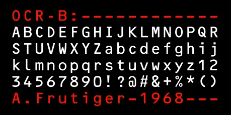
Each is designed to be easy for machines to interpret using the OCR process, but OCR-B, created by Adrian Frutiger, was specifically made to be equally natural for human eyes to read. Frutiger, best known for his extremely legible and popular Univers font family (1957), was a natural choice for the type foundry Monotype to make when it came to commissioning a human-friendly computer-readable typeface.

Print

When confronted with a character in a typeface which could be any number of possible letters or figures, the human brain usually works out the most likely option through a wealth of experience of reading, comprehension and looking at context. Computers, however, were not capable of that sort of interpretive process. OCR-A helped computers differentiate between characters by using some rather eccentric looking design choices, which helped the computer, but looked jarring and crude to the human eye.

This is the constant tension a type designer experiences when designing any new font family – how do you keep a sense of unity through an alphabet which has to be made up of distinct and unique characters? This common type design problem was amplified for Frutiger’s task – how to differentiate between characters enough for a computer to interpret them accurately, without sacrificing the typographic integrity that the human eye appreciates. This image shows how well Frutiger did – consider the I, l, 1 and i of Gill Sans below the same characters in OCR-B, and you’ll notice the lack of variation Eric Gill got away with:

Print

In designing OCR-B, Frutiger created a typeface which, while not as elegant as, for instance, Gill Sans, still retains typographic flair while providing a solution to the problems surrounding OCR computer technology. In a reversal of the story of HAL 9000 and his murderous insanity, it represents the best way technology should function – human and machine both putting themselves (as HAL himself says) “…to the fullest possible use, which is all I think that any conscious entity can ever hope to do.”

It is a sunny June 1981 afternoon in South West London, and an enraged New Yorker called McEnroe is screaming incredulously at a bemused tennis umpire named Edward James. The New Yorker, already a controversial figure in the sport, is in the process of articulating what will become one of the best known rants in sporting history:

Write John McEnroe’s words down and normal punctuation doesn’t seem adequate. In fact, consider anything about his manner, and general inadequacy starts to creep up on you – it takes a pretty remarkable level of self-assurance to abandon your dignity as much as McEnroe did, all while wearing a pair of shorts almost small enough to require their own place on the periodic table. And that’s before even considering his hair. The word ‘hair’ doesn’t feel big enough to properly convey what McEnroe has strapped down on his head, as ungainly and disproportioned as a knackered king size mattress on the roof of a Citroën 2CV. It’s the sort of hair that should be referred to with as many vowels as practicably possible: ‘haaaaaaaaaaaaaaair’, sounding like a scream on a roller coaster, or the roar of a lion (possibly as it shakes its McEnroe-esque mane, possibly while riding a roller coaster). So yes, all in all, normal punctuation just does not seem to work with McEnroe’s invective.

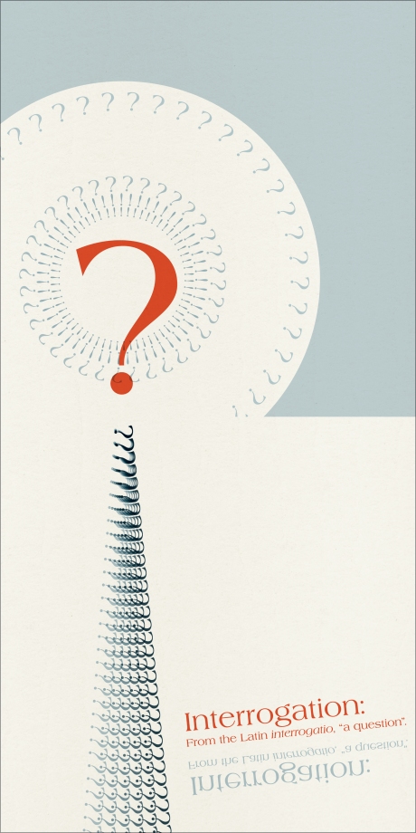
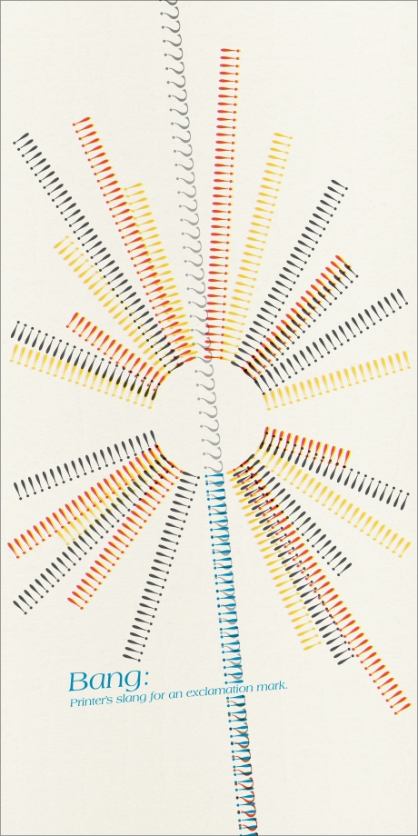
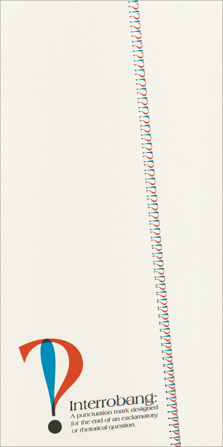
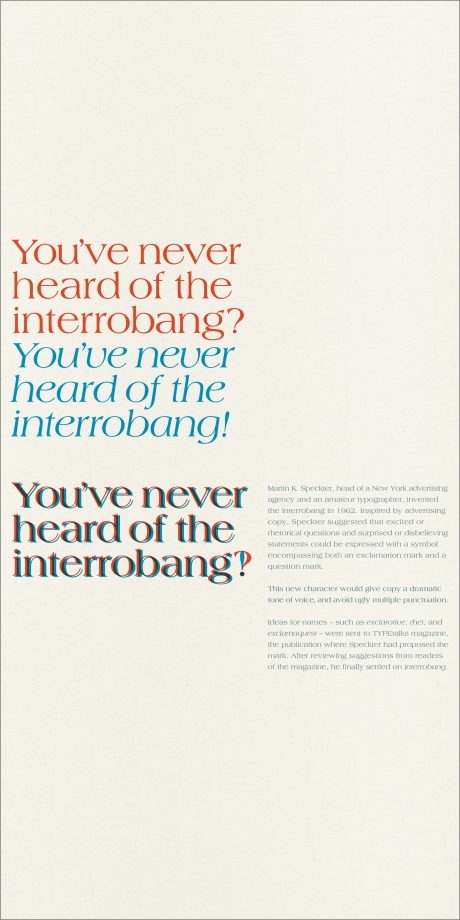
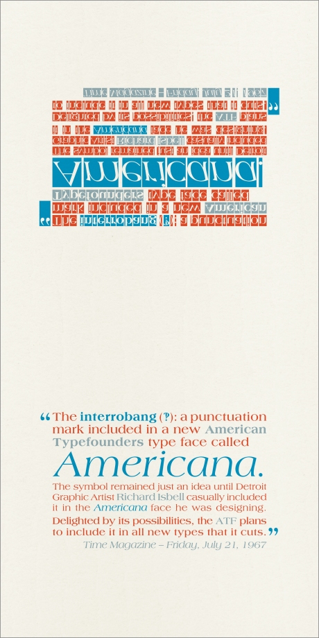
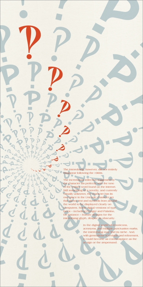
Fortunately, nearly 20 years before McEnroe’s Wimbledon rant, another New Yorker named Martin K. Speckter had considered the need for a punctuation mark designed to convey incredulous, excited or rhetorical questions. Speckter called it the “interrobang”, and this is my brief illustrated history of the mark that could have been made for McEnroe.

(This illustrated history originally made up the pages of a book I researched, wrote and designed in response to an ISDT brief in 2007. Click the images for high quality artwork.)

Untitled-1Untitled-1Untitled-1Untitled-1Untitled-1Untitled-1Untitled-1Untitled-1Untitled-1Untitled-1

Print

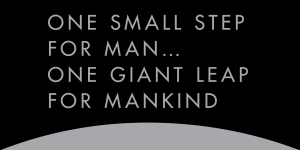
Neil Armstrong’s first words as he stepped onto the surface of the Moon are amongst the most famous in history. Imagine the immense pressure as, with the eyes of the world on you, you begin moving down onto the surface. You will forever be known as the first man to step foot on the Moon. Since the dawn of time, men have mythologised this place, dreamt of reaching it. You will be seen as a pioneer, a model of bravery and a standard bearer for the space age. Your words will be heard not just by mission control, 400,000 kilometres and 4 days of cramped space flight behind you, but by all of mankind, across the planet, for all of history. Your words matter. What you say next is important. This is the ultimate public speaking engagement. Don’t screw up. DO NOT SCREW UP.

“That’s one small step for man…”

You screwed up.

A pause. Maybe that pause was Armstrong realising his mistake. One small step for man? That doesn’t make sense. Man means mankind. You didn’t mean mankind, not yet – the mankind bit comes later! You meant man, as in you, because YOU ARE A MAN – you should have said ‘one small step for A man,’ you lunar idiot.

The pause is now dripping in dramatic tension and gravity. Which is ironic, as gravity is one of many things in which this particular extra-terrestrial body is lacking.

You carry on: “…one…” (another pause… too late now…) “…giant leap for mankind.”

Phew. Maybe, just maybe, you got away with it.

Armstrong’s understandably flustered moment of imprecision contained a mistake; an aural typo. The first printed words on the surface of the Moon, however, were not characterised by breathless excitement and imprecision, but by the precise, steady geometry of Futura.

Futura_moon_plaque

The lunar lander module, which to this day remains on the Moon’s surface, bears a plaque which proudly proclaims to any curious visitor in precise upper-case letters set in Futura Medium, and in terms which don’t confuse the concept of man and A man, “HERE MEN FROM THE PLANET EARTH FIRST SET FOOT UPON THE MOON JULY 1969, A. D. WE CAME IN PEACE FOR ALL MANKIND”.

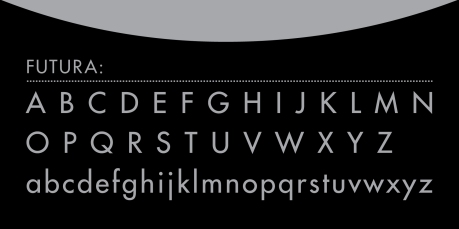
Why was Futura chosen for the task of communicating this message? Well, with its crisp, geometrically derived letter forms, Futura speaks in a clear and calm voice of an exciting modern age. When Paul Renner designed Futura in Germany in 1927, he wanted it to be new and modern, rather than a revival (or redesign) of an old font. He believed that his typeface should look and feel modern, and Futura still manages that more than 85 years later. It isn’t the longest-serving geometric sans serif typeface (that honour is held by the slightly more Germanic-looking typeface Erbar) but Futura is arguably the most successful.

Print

Futura’s alphabet is typified by efficiency and clarity. Each stroke seems to reject the history of typography wholesale – there are no serifs, flourishes, no real contrasting weight between strokes. The letter O is a Moon-like perfect circle. Other letters, such as the a, b and d are made from similarly circular bowls. Letter terminals finish cleanly and abruptly. Yet despite bold design choices, Futura still manages to carry a warmth with it. The proportions are well balanced, particularly in the lower case. The circular derivation of some of Futura’s lower case letterforms gives them a pleasing quality, with the x-height and the letter width being similar. The curve of the lower case u or the descender on the g are softly seductive in contrast to angular w and y’s straight descender. Crucially, there is no sign of the overtly German blackletter typefaces which would have been prevalent in Renner’s upbringing – Futura is a rejection of that type.

Renner’s own politics were fiercely anti-Nazi, and in 1933, when Hitler came to power, he was arrested as a political prisoner. In a way, his Futura reflects his opposition to nationalism. It is a typeface which, due to its characters being stripped of character, is universal and looks to a utopia free of nationalism or division.

After the Second World War many German scientists switched their allegiance to the USA. They had worked on perfecting rockets to land in towns and cities to bring death and destruction, but now saw a chance for forgiveness and rehabilitation, using their skills for a more peaceful purpose.

As they worked on the technology needed to send man to the Moon, and as America looked to a new age of space travel in the name of peace, it’s easy to understand why Futura was chosen to mark this start of a new age, with all its hopes for unity, rejection of the old, and celebration of the future.